CMYK vs RGB: What’s the Difference?
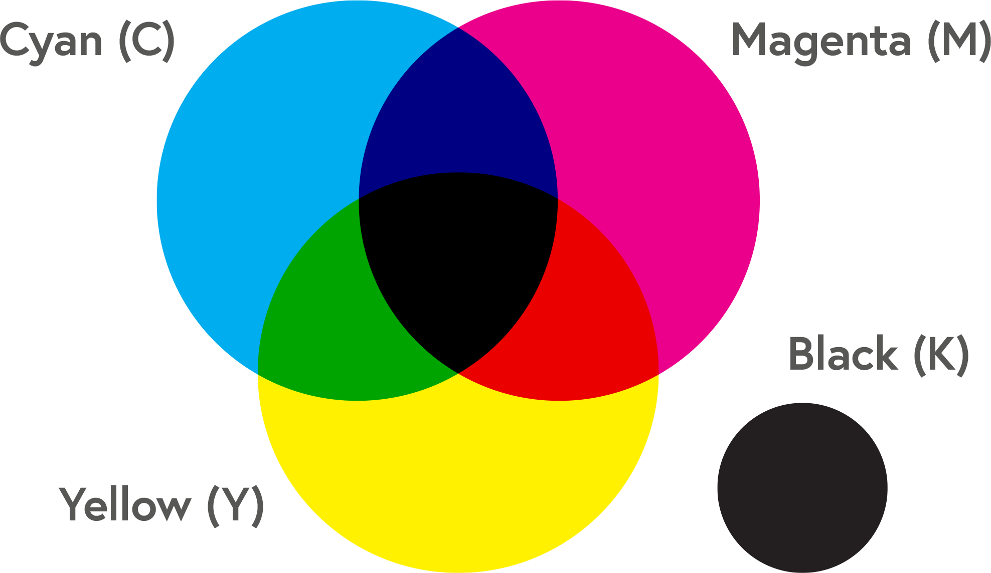
CMYK is an acronym for Cyan, Magenta, Yellow and Black (Key), representing the four ink colours used to create full-colour prints. It’s a subtractive colour profile, meaning if you start with a white background like a piece of paper, the more colour added, the darker it becomes. Paper is white because it reflects every wavelength of light. Using Cyan, Magenta and Yellow in different proportions subtracts specific colours of light to produce a wide range of colours, ensuring they appear within the printed colour spectrum.
RGB is an acronym for Red, Green and Blue, representing the three colours used to replicate colour on digital devices like computer screens, TVs and phones. RGB is a colour profile that uses light to make different colours, not ink. Unlike CMYK, it’s an additive colour profile because you create new colours by combining primary light colours. You can read about the differences between these two colour profiles here.
Our system accepts RGB (Red, Green and Blue) colour files. It will automatically convert them to their CMYK (Cyan, Magenta, Yellow and Black) equivalents for printing. And you can reference our CMYK values and formula charts to ensure you get bright, vivid colours when printing.

How To Convert RGB to CMYK
You cannot convert RGB to CMYK colours directly. When switching from light to ink, some RGB colours are impossible to reproduce in CMYK. But colour conversion is still possible. Our conversion guide will demonstrate how to do this in an easy-to-read format.
We recommend setting your artwork files to CMYK when you first set up your files or converting all RGB files to CMYK before uploading them to your Artwork Dashboard. Our system will automatically convert RGB files to CMYK anyway. RGB files are unsuitable for print as CMYK offers a variety of colours. You can then check your files by downloading and reviewing the proof.

Standard Black vs Rich Black: What’s the Difference?
In CMYK printing, Standard Black consists of black ink (100% K) and no other ink colour, while Rich Black contains Cyan, Magenta, and Yellow. Adjusting the amount of colour means you can achieve deep, more saturated tones. Black is one of the most frequently used colours and can vary immensely in black-and-white printing. But not all blacks will display the same or have the same purpose (e.g., outlining a graphic vs black text).
- When Do You Use Standard Black?
Standard Black is ideal for black text or fine lines. Occasionally, we recommend Standard Black over Rich Black if your print work includes fine details, like small text or speech bubbles in Comic Books. Even in a full-colour CMYK print, you should always use Standard Black. Otherwise, you run the risk of ghosting. Ghosting occurs when the four ink plates needed to make Rich Black produce microscopic variations that result in unwanted blurred shadows. Check out our comprehensive Standard vs Rich Black guide for more information.
- When Do You Use Rich Black?
Use Rich Black if you want to achieve deep tones. Our recommended Rich Black percentages are 30% Cyan, 30% Magenta, 30% Yellow and 100% Black. Our Colour vs Black and White Printing page will also show you examples of when it’s better to print blacks in full colour to achieve an intense black.


Colour Matching
Colours on a screen appear different compared to those on a printed page. Screens emit light, whereas print reflects it. Your choice of paper and finish can also affect the appearance of your colours.
CMYK ink can produce very slight colour variances between print runs - and minute colour variances within different copies on the same run. If colour is critical to your project, contact us, and our print experts will give you the guidance you need to get the desired results.
In offset printing, very subtle colour gradients can get lost, especially when ink saturations are very high. When this happens, your artwork can look darker than it appears on the computer screen.
If your ink saturation values are too high, the printed result can also appear darker than expected. This result is especially true with deep blues and blacks. You may like how they appear on a backlit screen, but they can appear much darker in print if your overall saturations exceed 300%.
In the case of single-colour saturations, light ink coverage under 10% may not print at all, while over 90% coverage may produce a solid colour. But our ink saturation and density guide will explain how to avoid extreme values and ensure every detail of your print is visible.
How Do I Check My Proof?
We recommend downloading and viewing your proof in Adobe Free Reader or Acrobat. Your proof best represents how the colours and content can appear in print. It will display all your artwork files in CMYK after colour conversion. You can learn more about how to proof your files here.


A Proof icon will appear above your page thumbnails when your artwork files fill every space. You can left-click this icon to generate your order's PDF proof.
Once you have generated your proof (it may take a few minutes depending on the file size and number of pages), right-click the Proof button and select Save Link As or Download, depending on which browser you use. Finally, once you have downloaded this, open it with Adobe Free Reader or Acrobat.
Remember, as your screen shows colours in RGB, there could still be some colour variance between what you see on your screen and in print. However, viewing the proof this way will minimise this possibility.